InstaChurch: Church Templates
Mobile-Optimized Websites!
Posted on Tue, Jul 24, 2012
Your website layout and front-page columns are now responsive to mobile devices! Click to learn more.
A revolution is taking place - people are moving from desktop computer to mobile devices, such as phones and tablets. It's grown from almost nothing a few years ago to a full 15% of our traffic, and growing very rapidly.
Our previous mobile-optimized iteration was "lacking", to say the least. It wasn't customizable, only had the primary content available, and didn't look like your regular website. We've started from the drawing board and begun the process of retooling your existing website to work well with mobile devices.
The first step, which you may have noticed recently, is that we've retooled most of our templates to be responsive, which means they adjust to the browser size. Try this experiment: load your web page on your desktop, then resize your browser to be wide and narrow. The website will automatically make adjustments based on the size, and the whole time, it will still look like your website.
For the front page columns, previously, to change your front-page column layout, you'd go to the "Front-Page Layout" item of your site's "Layout" menu and choose it from there. This gave you a short list of predefined layouts, with no easy way to customize them without getting deep into HTML/CSS code.
The new way gets rid of this, in favor of using our new Widget Columns feature. There are many benefits to this:
- You can easily switch back and forth between different column layouts from the "Options" button when you hover over them.
- You can now choose the width of your sidebars.
- Additional column types are possible, such as two/three column equal-width layouts.
But the biggest reason is that it allows us to make your front page responsive to the device size. Let's say you have a layout with a center column and two sidebars. This may look great on your giant desktop screen, but when someone visits on a small phone, they need to zoom way in to see any content. Now, the columns will resize and collapse cleanly into fewer columns on devices that won't fit the content otherwise.
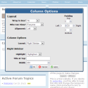
Goal #1 in this transition was to keep the experience the same for your desktop viewers - you shouldn't notice any difference. There there's one (rare) exception for this. Sidebars now have a fixed width - something we should have done from the beginning. If you have content that doesn't fit within this width, it will no longer stretch out the sidebar, it will instead create a scrollbar within that widget. If you find this on your site, no worries - you can hover over the columns and click "Options" in the blue box at the top-left of them. Set the sidebar width to something wider until the scrollbars disappear (or retool the content to be narrower, or more it into the wider main column).
One other qualification: if you have made changes to your layout, this "voided the warranty" on the fork of the template you created, so it won't have received our responsive updates. You can go back to the stock layout and re-incorporate your changes, or we can incorporate our changes into yours using a custom development project if you'd prefer. (Or you could leave it as-is, of course)
This is just phase one of our mobile optimization. Much of the content within our generated pages is still hard-coded for regular desktop viewers. Over time, we'll continue optimizations to bring all of the website content to your mobile visitors. Please let us know if you have any questions or comments!
 Please be patient, this will take a few seconds.

